Responsive Web Design and 960gs
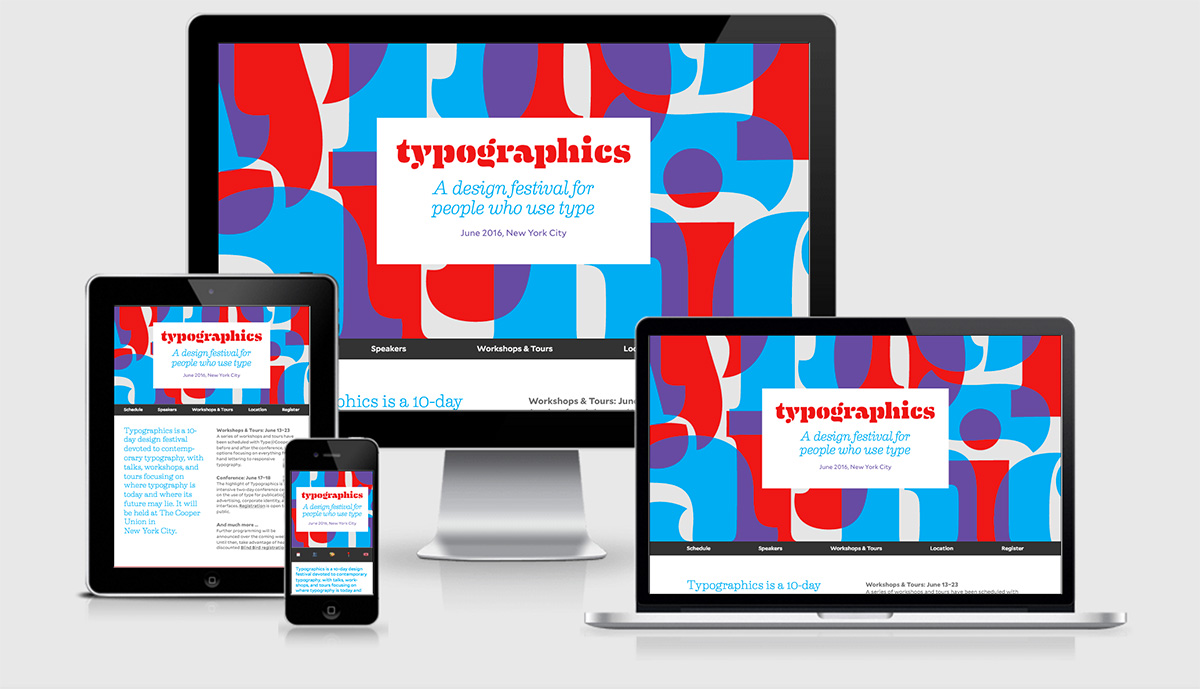
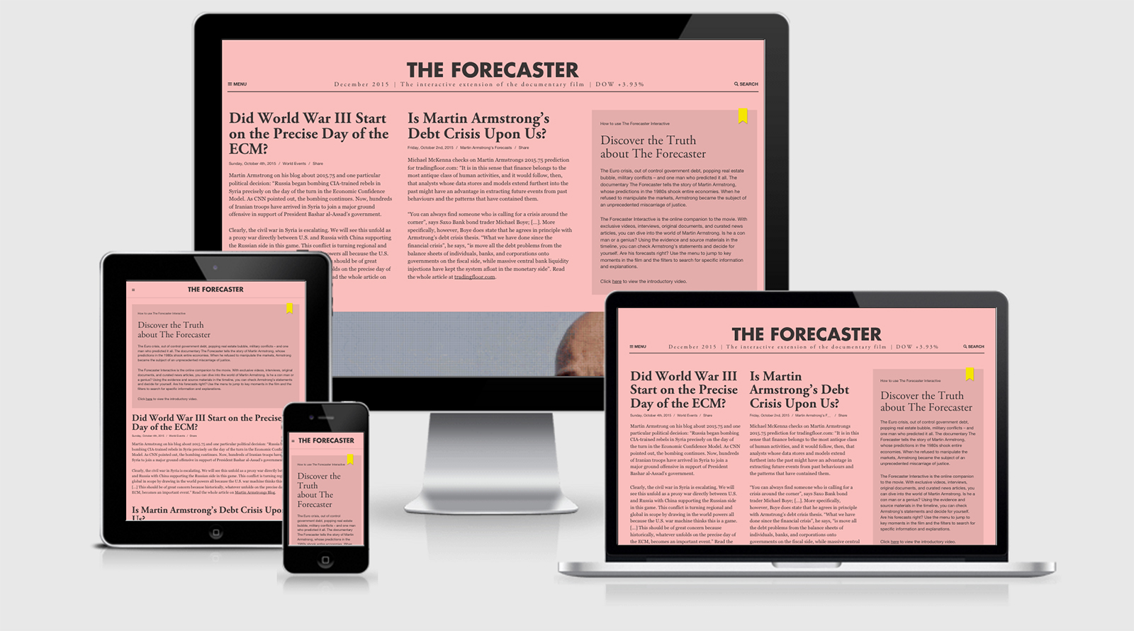
Currently, the industry standard for creating responsive websites is to use a 960 grid system. The 960 refers to the amount of pixels that are used in a standard presentation of a website. 960 is a special number because it is divisible by many different numbers, making it a great screen width to work with because it can easily be redefined to fit on different screen resolutions including HD monitors and mobile devices.
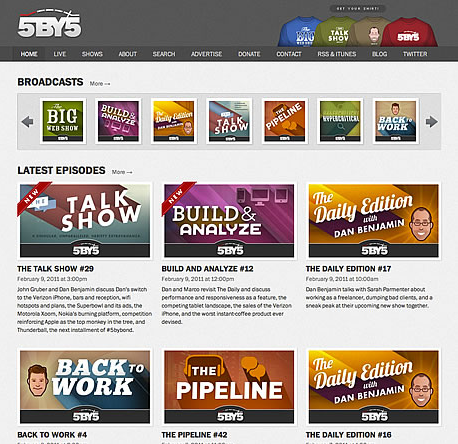
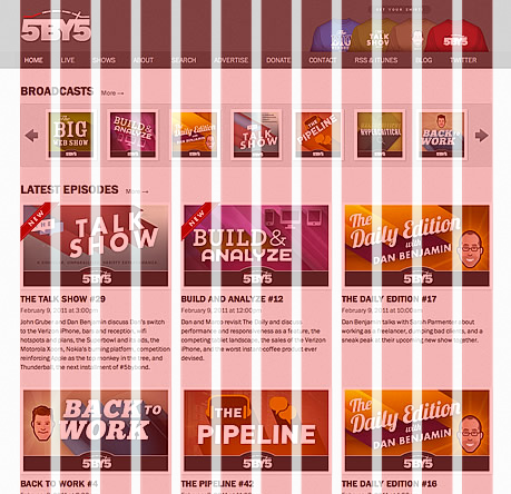
The Skeleton boilerplate is a set of predefined CSS files that cause it's predefined classes to resize themselves when viewed on devices of varying screen resolutions. The Skeleton boilerplate uses a 960 grid system with 12 column grids. The boilerplate makes it easy to quickly design the structure of a webpage. Then we web designers simply need to worry about what types of styles to use for the presentation.
Let’s get started building the structure and presentation of our 'index.html' web page.
Now Try
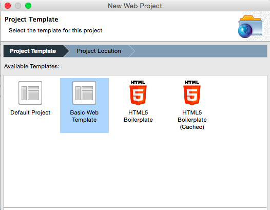
Create a “New Web Project” called ‘Responsive’. Be sure to choose “Basic Web Template”.
Now Try
- Download the Skeleton boilerplate.
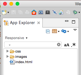
- Open up the zip file and copy and paste the files into the newly created ‘Responsive’ web project.
- You should overwrite the existing ‘index.html’ file.

Remember to think about what type of content you want your website to contain because that will largely determine which webpages you choose to use on your website. We will be using one of the web pages to create a javascript game, but other than that, the site is yours to use as you see fit. Some ideas would be a website to showcase the projects you have completed during your high school years, one detailing your passions, or even a collection of your favorite web apps, videos and web pages.
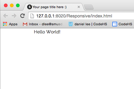
Let’s get started building the index page of 'codecreative.us’. Open the index file that came with the Skeleton files. You should see many lines of code that make you feel uncomfortable. Ignore that feeling as it diminish as you progress through this tutorial. Start by erasing everything inside the ‘container’ div class. Replace those tags with the following tags:
...
<div class="container">
    <div class="twelve columns">
	Hello World!
    </div>
</div>
...
The Index Page

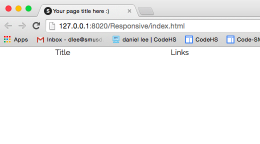
Let’s start by building the top portion which happens to be the the header. If you notice, the web page’s title text is aligned left, while the navigation links are aligned to the right of the screen. To get this effect, we will need to define each div box as being in a parent div box. We will use the built-in tag ‘header’ to contain these divs.
To begin construction the webpage above, add the following code to your webpage:
<body>
	<div class=”container”>
		<header>
			<div class=”three columns”>
				Title
			</div>
			<div class=”nine columns”>
				Links
			</div>
		</header>
	</div>
</body>
Now Try
Create a CSS file called ‘styles.css’. Be sure to add the link tag in your ‘index.html’ or your web page will not use the classes that you define.
Now Try
- Create a CSS class called ‘icon’ that will use a Google Font of your choice.
- Define a font color, font size, 'text-align: right' and text-shadow.
<header>It is important to understand that div classes can use more than one class. Here, our div class is using the ‘three’ class, ‘columns’ class and the class we just defined, ‘icon’. The first two define how wide the div is going to be and the last one applies our presentation properties.
<div class=”container”>
<div class=”three columns icon”>
Title
</div>
<div class=”nine columns”>
Links
</div>
</div>
</header>
Make the following adjustment to your html file:
<header>Preview your web page and you should see that now the text in the 'icon' div is aligned to the left and the text in the ‘links’ div box is on the right side of the screen. Compare your results with the picture below.
<div class=”container”>
<div class=”three columns icon”>
Title
</div>
<div class=”nine columns u-pull-right”>
Links
</div>
</div>
</header>

Now, you need to create an unordered list that will contain a set of links for your website.
Now Try
- Create an unordered list that will contain the navigation links as bullet points.
- Create a set of CSS styles for your unordered list called ‘nav’.
- Apply the CSS styles by adding the 'nav' class to your unordered list.

Padding
When you preview your web page, you will notice that your ‘icon’ and ‘links’ div boxes are spaced incorrectly when compared to ‘Marquee’. To get the spacing correct, we will need to use the padding property in the ‘icon’ or ‘links’ div.
To add padding, we could create a CSS class called ‘about_padding’ and add this class to the ‘icon’ and ‘links’ div. However, this causes problems because if you follow this model, by the time you are done with your website, you will have several dozen different classes that all specify a certain amount of padding.
Instead, let’s define a set of classes that each define a certain amount of padding. Then we can use these classes over and over throughout our website. We are only going to define top and bottom padding using our classes.
Add the following classes to your CSS file:
.padding_tiny{
	padding: 10px 0px 10px 0px;
}
.padding_small{
	padding: 15px 0px 15px 0px;
}
.padding_med{
	padding: 20px 0px 20px 0px;
}
.padding_big{
	padding: 30px 0px 30px 0px;
}
.padding_bigger{
	padding: 40px 0px 40px 0px;
}
.padding_biggest{
	padding: 50px 0px 50px 0px;
}
Now Try
Use our new padding classes to create space around the 'icon' and 'links' div boxes in our header. Remember that to use two class, simply write both of their names with the double quotes.
** For example: <div class="six columns icon padding_med">
Once you have made the above changes, compare your results with the example below.

Some Loose Ends
Preview your web page and now your navigation links should look beautiful, aligned in a row, with a drop shadow, and have some type of hover action.
Pass your mouse over the ‘icon’ div box on 'codecreative.us'. Notice that the text is clickable and has a hover property? Let’s create the same behavior before moving on:
Now Try
- Use the <a> tag to make the contents of the ‘icon’ div box clickable.
- Set the ‘href’ field to ‘index.html’.
- Create another set of link classes similar to 'nav' that will define the behavior of this link.
Modify your code as follows:
<header>
	<div class=”three columns”>
		Title
	</div>
	<ul class=”nav”>
		...
	</ul>
</header>
<div class=”container”>
	...
</div>
Now Try
- Add the ‘float’ property to your ‘icon’ class and set it to ‘left’.
- Add the ‘float’ property to your ‘nav’ class and set it to ‘right’.
When you are done, compare your results with the example below before moving on.

Our header is looking better, but if you compare it with the one found on 'codecreative.us', you can see that we are missing space on each side of the webpage. Let's add that now.
To add space to each side of our webpage's header, we can add padding to the left and right side of the <header> tag. Do that now.
Now Try
- Create an id called 'head'
- Add a padding property to 'head' to add '5%' padding to the left and right side of the div box.

Great, our <header> looks perfect and we can now move on!
Article

We will be using two separate div boxes because each div’s font type and size is styled differently. In order to accomplish this, we will need to define two separate id’s and apply them to each div. Here we will use id’s because never again will we use these sets of properties in our website.
Add the following code to your html file:
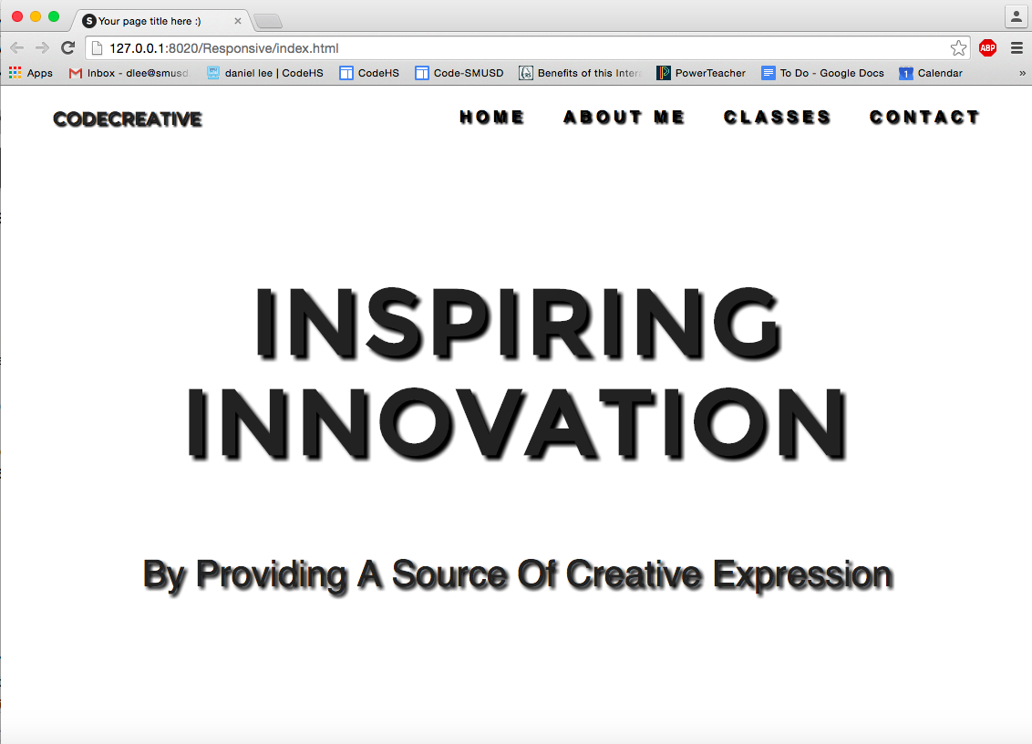
<body>Preview your web page and compare your results with the example below. You will see that now there are two lines of text, however they aren’t looking too good. Let’s change that.
<div class=”container”>
...
<article class="container">
<div class=”twelve columns”>
Index Text
</div>
<div class=”twelve columns”>
Index Blurb
</div>
</article>
</div>
</body>

Now Try
- Define an id called ‘index_title’.
- Stylize ‘index_title’ using a Google Font.
- Center the text by setting the ‘text-align’ property to ‘center’.
- Add padding, text-shadow, letter-spacing and line-height.
- Repeat this process for your newly created id ‘index_blurb’.
Now Try
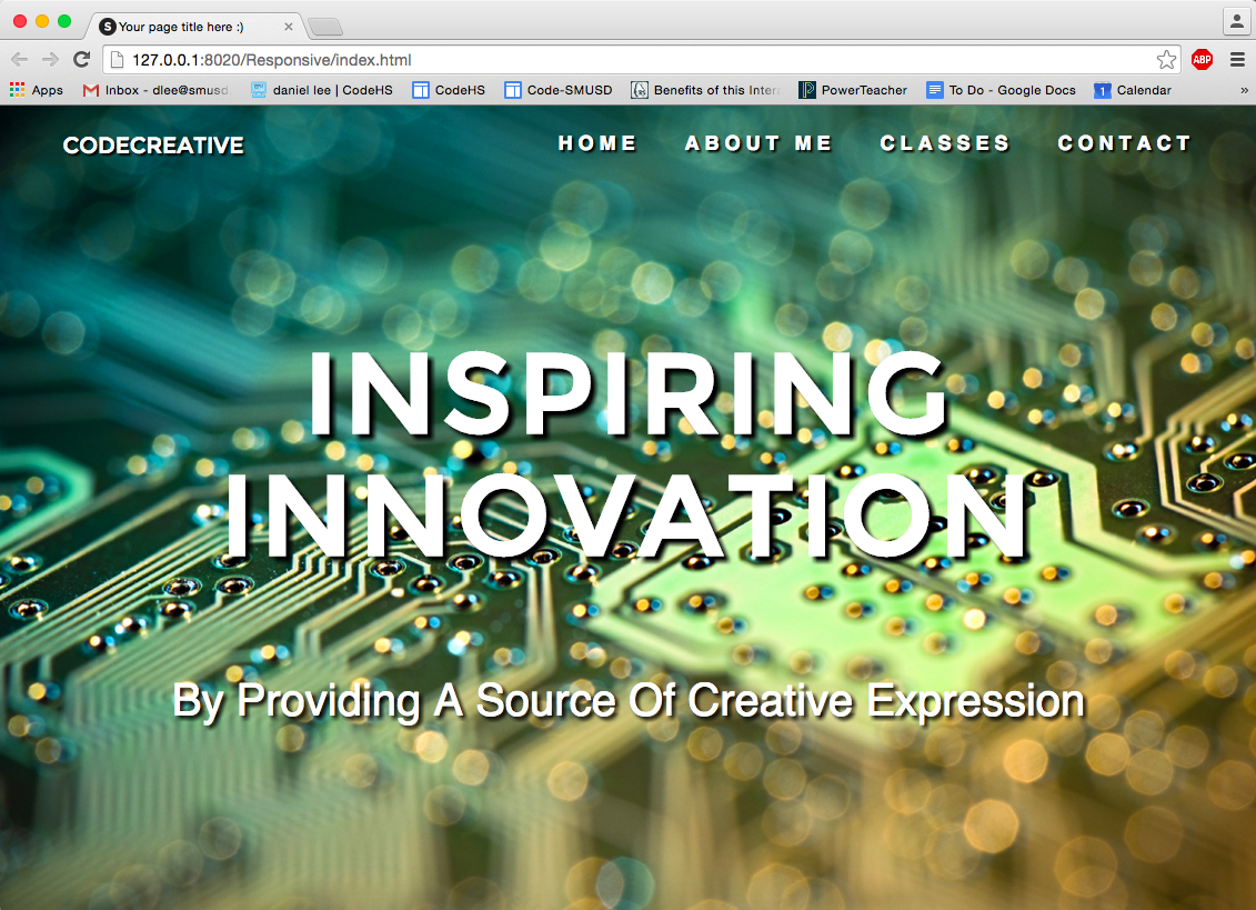
- Create an id called ‘index_back’.
- Define a background for 'index_back'. Be sure that the background image stretches along the x and y axis.
- Apply the id to the <body> tag.
The About Me Page
Now Try
Create ‘aboutme.html’ by saving ‘index.html’ as ‘aboutme.html’.
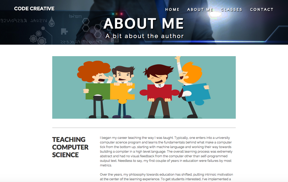
Take a look at the 'About Me' page on ‘codecreative.us’ to the right. Notice that the header is identical to the header in index, except that ‘About Me’ has a different background image and title. Let’s make those changes now:
Now Try
- Find a picture on Google that will act as your background.
- Manipulate your picture using Photoshop so that it has proportions of 1900x350 pixels.
- Save the picture in your images folder and add the picture as the background of the header. Be sure to add the set of properties that stretch the picture on the x and y axis.
- Create classes called ‘page_title’ and 'page_blurb' stylize them according to your preference.
- Add a twelve column div box and title text in header using the class 'page_title'.
- Add a twelve column div box and blurb text in header using the class 'page_blurb'.
Article

Now Try
- Find a picture for the first section of your ‘About Me’ page.
- Manipulate the picture to be 950x300 pixels.
- Add a twelve column div box as the first element in your article.
- Add the picture to the article inline using the
tag.
- Set the height inline by adding the ‘height=#px’.
- Set the width by using the built-in Skeleton class ‘u-max-full-width’ class.
- Using CSS, create a class called ‘about_image’ and set the bottom border property using ‘border-bottom: 1px solid gray’.
- Set a padding using our padding classes.
- Use the class 'about_image' in your image tag.

Subtitle and Text
The subtitle element is three columns wide and the text element is nine columns wide. As can be seen in the 'About Me' picture above, each has their own CSS class. Let's start by creating the structure of this section.

Let's put together the structure of the subtitle and text now.
Now Try
- Create a twelve column element and place it after the picture element.
- Create a three column element and nine column element. Place both in the twelve column element.
- Add text to both the three column and nine column elements.
- Using CSS, create a class called ‘subtitle’.
- Stylize ‘subtitle’ according to your preference.
- Set 'subtitle' as the class for the three column element.
- Using CSS, create a class called ‘text’.
- Stylize ‘text’ according to your preference.
- Set 'text' as the class for the nine column element.

Now Try
Complete the content for the ‘About Me’ page with at least two other sections.
Footer

Now Try
- Add a footer tag in your html. Be sure to place it after the end of the ‘container’ div box.
- Add appropriate text to your footer.
- Create a CSS class called ‘foot’ and stylize your footer.